My name is Sydney Schultz, and I am a Graphic Communication student at California Polytechnic State University—San Luis Obispo. This portfolio is designed to showcase the work I have completed in my Data Management & Visualization class.
Excel
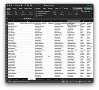
Data Cleaning
This spreadsheet serves as a comprehensive demonstration of fundamental data cleaning techniques using Microsoft Excel. Through a series of practical examples, it showcases the application of various Excel functions and features to efficiently clean and manipulate data. Key processes covered include:
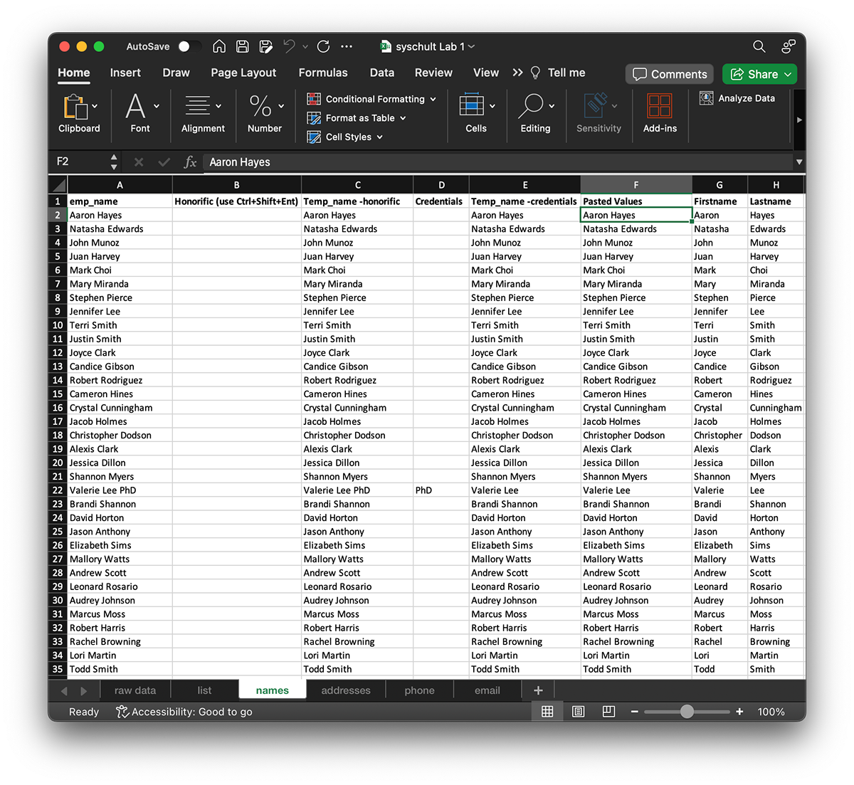
Formulas with RIGHT, LEFT, SUBSTITUTE, and CONCATENATE functions: Utilizing these functions allows for precise manipulation of text data. RIGHT and LEFT functions enable extraction of characters from the right or left side of a string, respectively, facilitating tasks such as extracting prefixes or suffixes. SUBSTITUTE function aids in replacing specific text within a string, crucial for correcting errors or inconsistencies. CONCATENATE function combines multiple strings into a single cell, streamlining data formatting tasks.
Flashfill: This dynamic feature automates the extraction and transformation of data based on user-provided examples. By recognizing patterns in data entry, Flashfill intelligently populates adjacent cells, significantly expediting repetitive data cleaning tasks.
Text to Columns: Text to Columns feature splits data in a single column into multiple columns based on specified delimiters. This capability is invaluable for parsing structured data, such as addresses or CSV files, into separate fields for analysis or further processing.
Conditional "If" Statements: Conditional statements enable the application of logical criteria to manipulate data dynamically. By using the IF function, users can define conditions to perform specific actions based on the values within a dataset. This facilitates tasks such as categorizing data, flagging anomalies, or applying custom transformations based on predefined rules.
Contextual Menus
In the second week of our course, we advanced our Excel skills beyond basic functions by exploring the versatile capabilities of the Data Validation tool. With Data Validation, we were able to enhance the usability and accuracy of our spreadsheets by creating dynamic drop-down menus, empowering users to select predefined options from a list.
Data Validation offers a powerful means to control and standardize data entry by restricting inputs to a predefined set of values or criteria. By setting up drop-down menus using Data Validation, we introduced a user-friendly interface that guides users in selecting valid options, thereby reducing errors and ensuring data consistency.
Throughout this week's lessons, we delved into the intricacies of setting up Data Validation rules to suit various data entry requirements. We learned how to create dropdown lists sourced from static ranges within the spreadsheet, providing a fixed set of options for users to choose from. Additionally, we explored the dynamic capabilities of Data Validation, enabling dropdown lists to update automatically based on changes in the underlying data source.
Furthermore, we discovered how to customize Data Validation settings to enforce additional constraints, such as specifying allowable input ranges, setting custom error messages, and defining input restrictions based on formula-based criteria. These features empower us to tailor the behavior of our drop-down menus to suit specific data validation needs, whether it be enforcing data integrity, guiding user input, or streamlining data entry workflows.
By mastering Data Validation and incorporating drop-down menus into our spreadsheets, we have unlocked new levels of efficiency and accuracy in data management. Whether organizing survey responses, categorizing products, or selecting project statuses, the implementation of Data Validation ensures that our Excel workbooks remain robust, user-friendly, and error-free.
Conditional Formatting
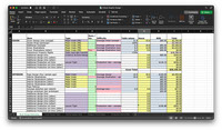
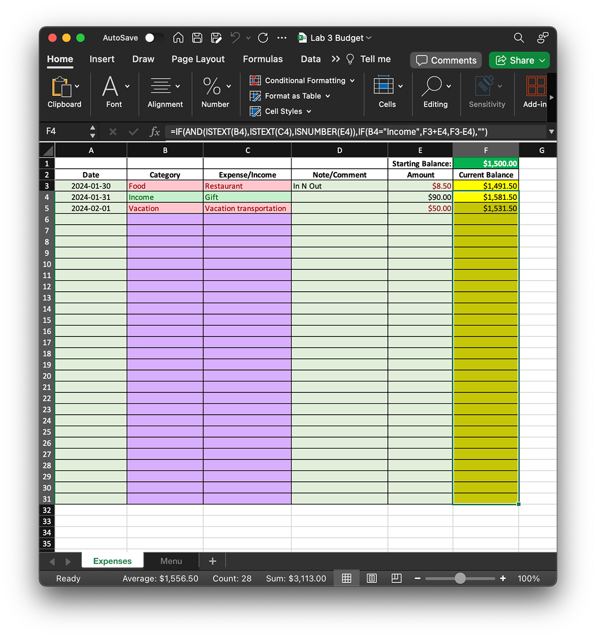
Building upon our foundation of data validation and dropdown menus, we elevated our Excel proficiency by integrating conditional formatting into our budget tracking spreadsheets. This strategic addition allowed us to visually distinguish between different types of financial transactions, enhancing clarity and insight into our budgeting process.
In the context of budget tracking, accurately categorizing expenses and income is paramount for financial analysis and decision-making. With conditional formatting, we were able to assign visual cues to different categories, making it easier to identify and interpret financial data at a glance.
By implementing conditional formatting rules, expenses were dynamically highlighted in red while income entries were displayed in green within our budgeting spreadsheets. This color-coded approach immediately drew attention to the nature of each transaction, enabling users to quickly discern between outgoing expenditures and incoming revenue.
The integration of conditional formatting not only improved the visual appeal of our budgeting documents but also provided practical benefits in terms of data analysis and monitoring. With expenses and income clearly differentiated, users could easily track spending patterns, identify budgetary trends, and assess financial health with greater efficiency and accuracy.
Furthermore, the flexibility of conditional formatting allowed us to customize formatting rules based on specific criteria and preferences. Whether categorizing transactions by type, amount, or date, we could adapt the visual representation of our budget data to align with our unique tracking requirements and reporting needs.
In summary, by incorporating conditional formatting alongside data validation and dropdown menus in our budget tracking spreadsheets, we have enhanced both the usability and effectiveness of our financial management tools. This integrated approach not only facilitates clearer communication of financial information but also empowers users to make informed decisions and take proactive measures to achieve their financial goals."
Lookups
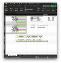
In this comprehensive project, we seamlessly integrated several advanced Excel features, including data validation, conditional formatting, and calculations with lookup functions, to create a robust and user-friendly data management system. Central to our approach was the strategic use of conditional formatting not only to enhance the visual appeal of our spreadsheets but also to guide users in inputting accurate and complete information.
Conditional formatting played a crucial role in our project by dynamically highlighting input fields in blue, signaling to users where data entry was required. By visually distinguishing these fields, we provided clear cues to users, prompting them to input necessary information and minimizing the risk of oversight or error.
Furthermore, we leveraged powerful lookup functions such as VLOOKUP and MATCH statements to automate data retrieval based on user inputs. These functions enabled us to dynamically populate blue fields with relevant information drawn from different worksheets within our Excel workbook.
To streamline the lookup process, we practiced the technique of naming Table Arrays, Lookup Arrays, and Menus on our secondary sheets. By assigning meaningful names to these data ranges, we enhanced the readability and maintainability of our formulas, making it easier to understand and update them as needed.
Through the integration of data validation, conditional formatting, and calculations with lookup functions, we created a sophisticated yet user-friendly data management solution. By guiding users through the input process and automating data retrieval, our Excel project not only improves efficiency and accuracy but also empowers users to make informed decisions based on timely and reliable information.

Advanced Lookups & Conditional Formatting
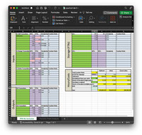
In this advanced Excel project, we demonstrated mastery over a wide range of lookup and conditional formatting techniques, including both vertical and horizontal lookups (VLOOKUP & HLOOKUP), nested MATCH statements, and sophisticated logic within conditional formatting rules.
Vertical and horizontal lookups, facilitated by VLOOKUP and HLOOKUP functions respectively, are essential tools for retrieving data from tables based on specified criteria. VLOOKUP allows us to search for a value in the leftmost column of a table and return a value in the same row from a specified column. Meanwhile, HLOOKUP performs a similar operation but searches across the top row of a table and returns a value from the same column in the specified row. By mastering both types of lookups, we gain the flexibility to retrieve information from tables organized in either vertical or horizontal orientations, expanding the scope of our data analysis capabilities.
Additionally, we employed nested MATCH statements to further enhance the sophistication of our lookup operations. MATCH is a powerful function used to locate the position of a specified value within a range. By nesting MATCH functions within our VLOOKUP or HLOOKUP formulas, we were able to dynamically determine the exact row or column where the desired information resides, enabling precise data retrieval even in complex data structures.
Furthermore, we leveraged advanced logic within conditional formatting rules to apply dynamic formatting based on intricate criteria. By combining logical functions such as IF, AND, OR, and nested IF statements within our conditional formatting rules, we could create highly customized formatting effects tailored to specific conditions. This allowed us to highlight outliers, identify trends, or visualize patterns within our data with precision and clarity.
Through the integration of vertical and horizontal lookups, nested MATCH statements, and advanced logic in conditional formatting, our Excel project showcases a sophisticated approach to data analysis and visualization. By harnessing the full power of these techniques, we unlock new possibilities for extracting insights from complex datasets and presenting information in a visually compelling manner.
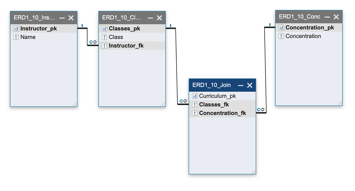
Entity Relationship Design
In the context of this class, entity relationship design refers to the process of structuring and organizing data within a database system. It involves identifying the entities (or objects) within a dataset, defining the relationships between these entities, and determining the attributes associated with each entity. Entities are real-world objects stored in a database, such as customers, products, or orders, while relationships define how these entities are interconnected, like the link between customers and orders in a retail database.


Entity relationship design typically involves creating entity-relationship diagrams (ERDs) to visually represent the structure of the database. ERDs use symbols such as rectangles (for entities), diamonds (for relationships), and ovals (for attributes) to illustrate the relationships between different entities and their attributes.
Storytelling with Data
In my journey of learning to tell stories with data, I encountered a crucial realization early on: the power of sketching as a starting point for organizing my ideas. As a beginner, I often felt overwhelmed by the sheer amount of data and unsure of how to translate it into a coherent narrative. However, by taking the simple yet effective approach of sketching my ideas on paper, I found a way to navigate this initial uncertainty.
Sketching provided me with a low-pressure environment to explore different possibilities and brainstorm creative ways to visualize the data. Despite some initial frustration with using pen and paper, I quickly discovered the liberating effect of embracing this tactile medium. Doodling random ideas helped me break through mental barriers and tap into my creativity, ultimately leading to innovative solutions that I may not have considered otherwise.


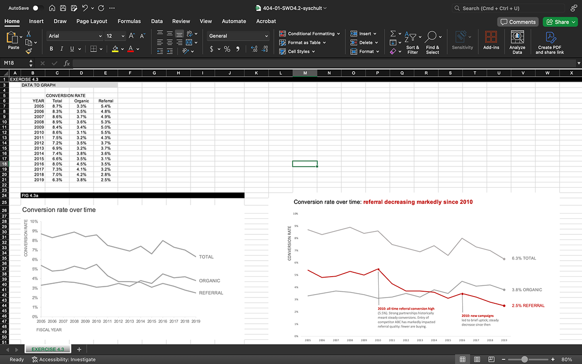
Transitioning from paper sketches to creating graphs in Excel marked a shift in my workflow. While the drawing process on paper was intuitive and free-flowing, working within the constraints of Excel introduced new challenges and considerations. However, I found that this transition also brought its own set of advantages.
One of the notable benefits of creating graphs in Excel was the convenience of utilizing recommended chart types. These predefined templates offered a quick and easy way to visualize data without the need for extensive manual configuration. This streamlined approach not only saved time but also provided valuable insights into effective data visualization practices.
Moreover, I discovered the value of adding additional elements to my graphs that weren't originally part of my sketches. This adaptability allowed me to incorporate new insights or emphasize key points, enhancing the overall clarity and impact of my visualizations.


Reflecting on my experience, I recognize the broader applicability of these strategies beyond data storytelling. The iterative design processes involved in fields such as app design, product development, and user experience (UX) design can benefit immensely from the creative exploration and iterative refinement facilitated by sketching and rapid prototyping.
Tableau
For my final project, I conducted an in-depth analysis of movie and TV streaming data across several prominent online platforms, drawing insights from three distinct datasets. To kickstart my analysis, I utilized Tableau Prep Builder to meticulously examine each dataset, allowing me to understand its structure, identify relevant variables, and prepare the data for subsequent analysis in Tableau Desktop. I cleaned and standardized the data, including performing a "union" operation to combine datasets efficiently. This process ensured data accuracy and consistency for subsequent analysis.


After refining and cleaning my data using Tableau Prep Builder, I seamlessly imported the updated dataset into Tableau Desktop to embark on the visualization journey. Leveraging Tableau's intuitive interface and powerful visualization capabilities, I delved into creating an array of visual representations to illuminate various facets of the data. Exploring diverse chart types, from bar graphs to scatter plots, I aimed to uncover insightful patterns and trends hidden within the dataset. This exploratory phase allowed me to experiment freely, generating multiple visualizations to gain a comprehensive understanding of the data from different perspectives. Once satisfied with the breadth of visualizations, I transitioned to the refinement stage, where I curated the most impactful visualizations into cohesive dashboards. This iterative process involved refining layouts, adjusting visual elements, and fine-tuning interactivity to craft compelling narratives that effectively communicated key insights. Through this meticulous approach, I transformed raw data into meaningful stories, empowering stakeholders to glean actionable insights and make informed decisions.


Following the visualization of my data in Tableau Desktop, I compiled my findings into a multi-page story, presenting a coherent narrative that showcased the insights gleaned from the analysis. Crafting each page with care, I highlighted key discoveries and trends, ensuring that the story flowed logically and captivated the audience. As I finalized and published my work, I felt a sense of accomplishment, knowing that my dedication to practicing storytelling with data had yielded tangible results. This experience reinforced the importance of clear communication and effective visualization in conveying complex information, and it motivated me to continue honing my skills in data storytelling for future projects.